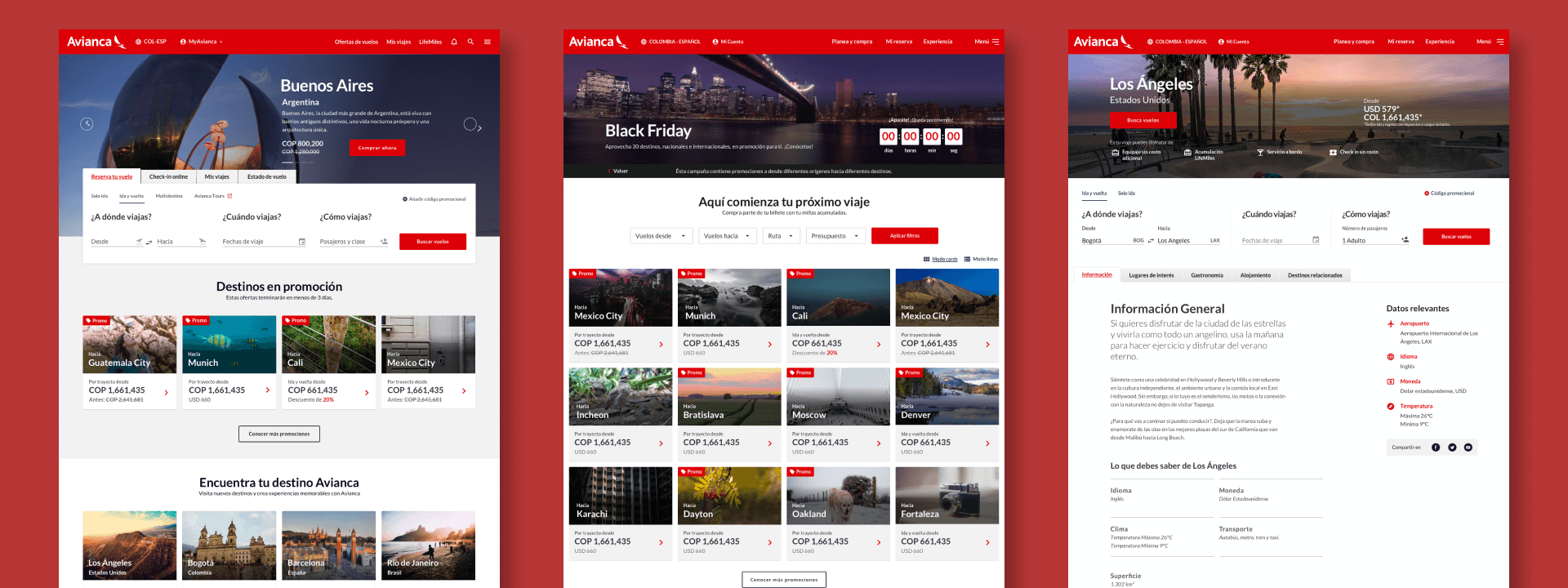
Modular CMS for 19 Markets
Avianca sold 90% of tickets through third parties. We were brought in to redesign the website — and spent three months designing pages before we learned we should have been designing modules.
My role
Service & Interaction Designer
Timeline
6 months (extended for stability)
Design Team
3 IxD, 3 VD, 2 Leads + dev teams across 3 countries
Design Tools
Sketch/Zeplin/Jira
The Stakes
Avianca sold 90% of its tickets through third parties like travel agencies. Every external booking meant lost margin. New digital leadership arrived in 2018 with a clear mission: take back the sales funnel.
The website was the obvious problem. Desktop-only in the mobile era — travelers pinched and zoomed to book on their phones. But this wasn't a simple redesign. Avianca operates across 19 Latin American markets. Each needs different content, languages, promotions, seasonal campaigns.
Fjord was brought in to redesign the web experience. My role: turn service design strategy into production screens for an Adobe Experience Manager platform I didn't fully understand yet.

What We
Didn't Know
The service design team had done solid strategic work — five personas, journey maps, a service blueprint showing the ideal experience. Our job: translate that into interfaces across three breakpoints.
We divided the most important screens among the design team. Wireframes first, then final mockups. Three months of production.
When development started implementing, the result looked nothing like what we'd designed.
That's when the dev team explained what we'd missed. Adobe Experience Manager doesn't work like a blank canvas. The CMS had strict restrictions on styles, layouts, and components. You can't design full pages and hand them over — you have to design within the platform's module architecture.
Three months of work built on wrong assumptions about the technology. The mockups were beautiful. They were also unbuildable.
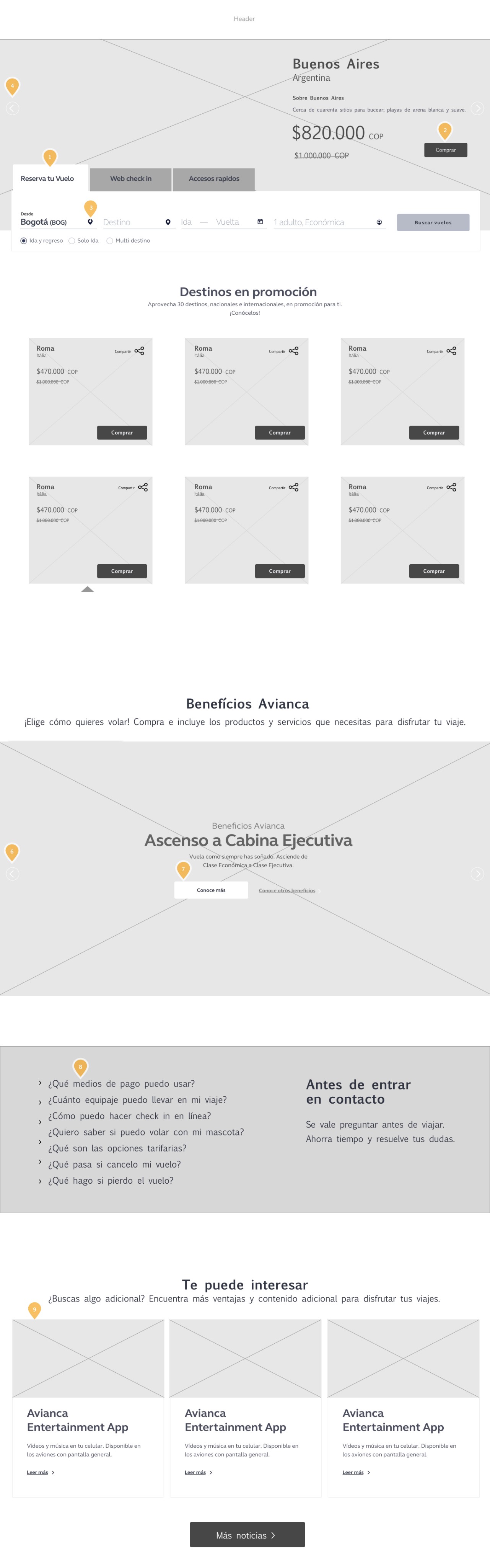
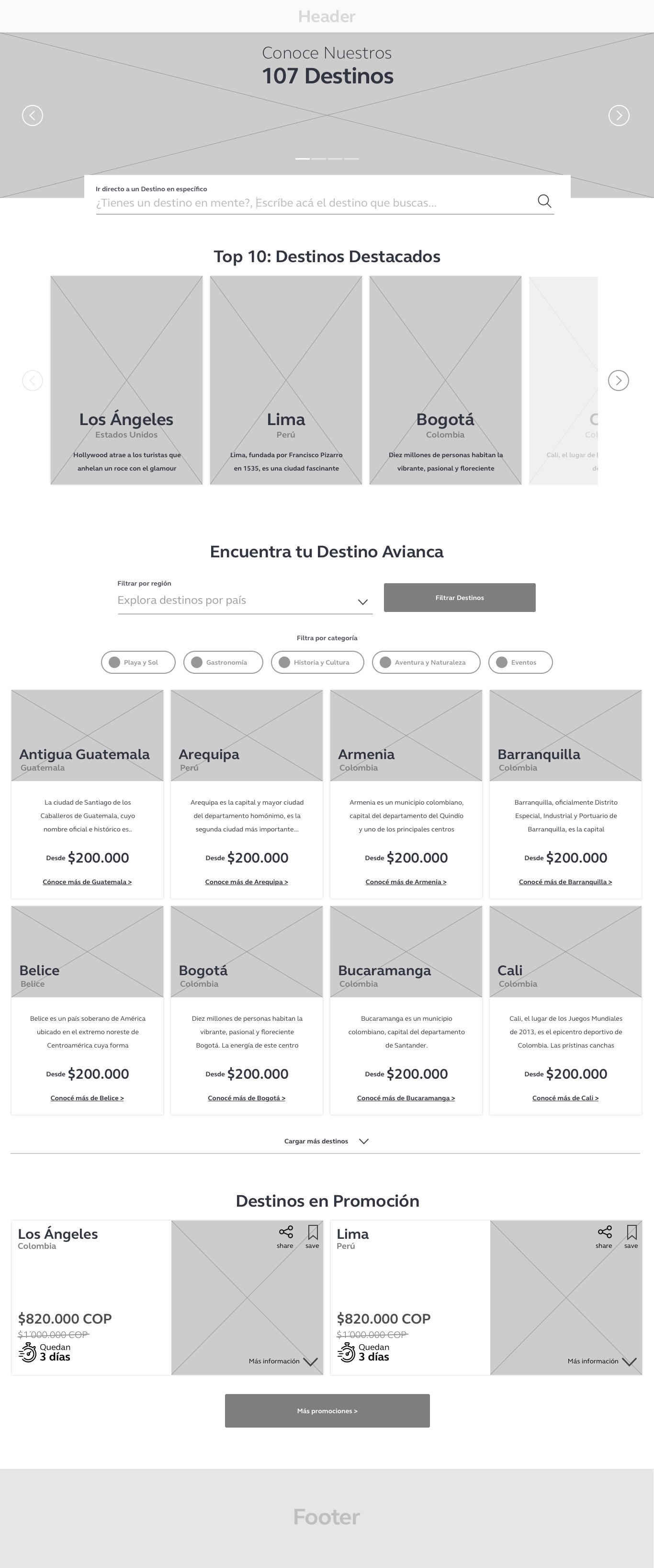
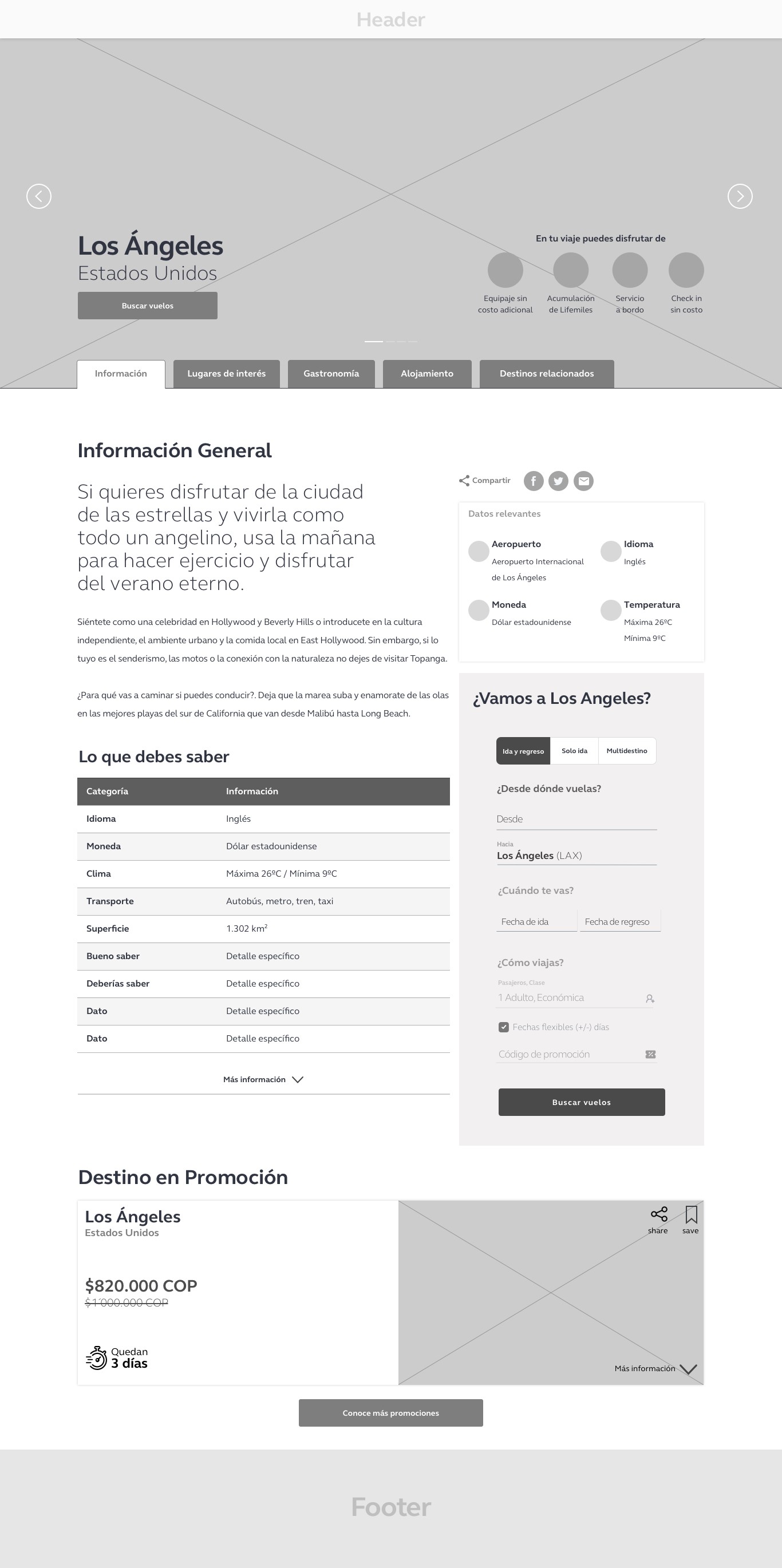
early wireframes / full-page mockups that became obsolete
The Pivot
The design and development leads found the answer together: stop designing pages, start designing modules.
Instead of full-page mockups, we'd create responsive content modules — hero blocks, content cards, CTAs, media grids — each with administration parameters. Content teams across 19 countries could drag, drop, and configure without touching code. This changed the entire scope and strategy for both design and development.
Our page mockups became reference material, not deliverables.
The hard part wasn't the pivot itself. It was deciding which pages stayed locked for consistency (homepage, seasonal campaigns, travel destinations, booking flows) and which became fully modular. Too much freedom and the brand breaks across 19 markets. Too little and content teams go back to requesting every change through developers.
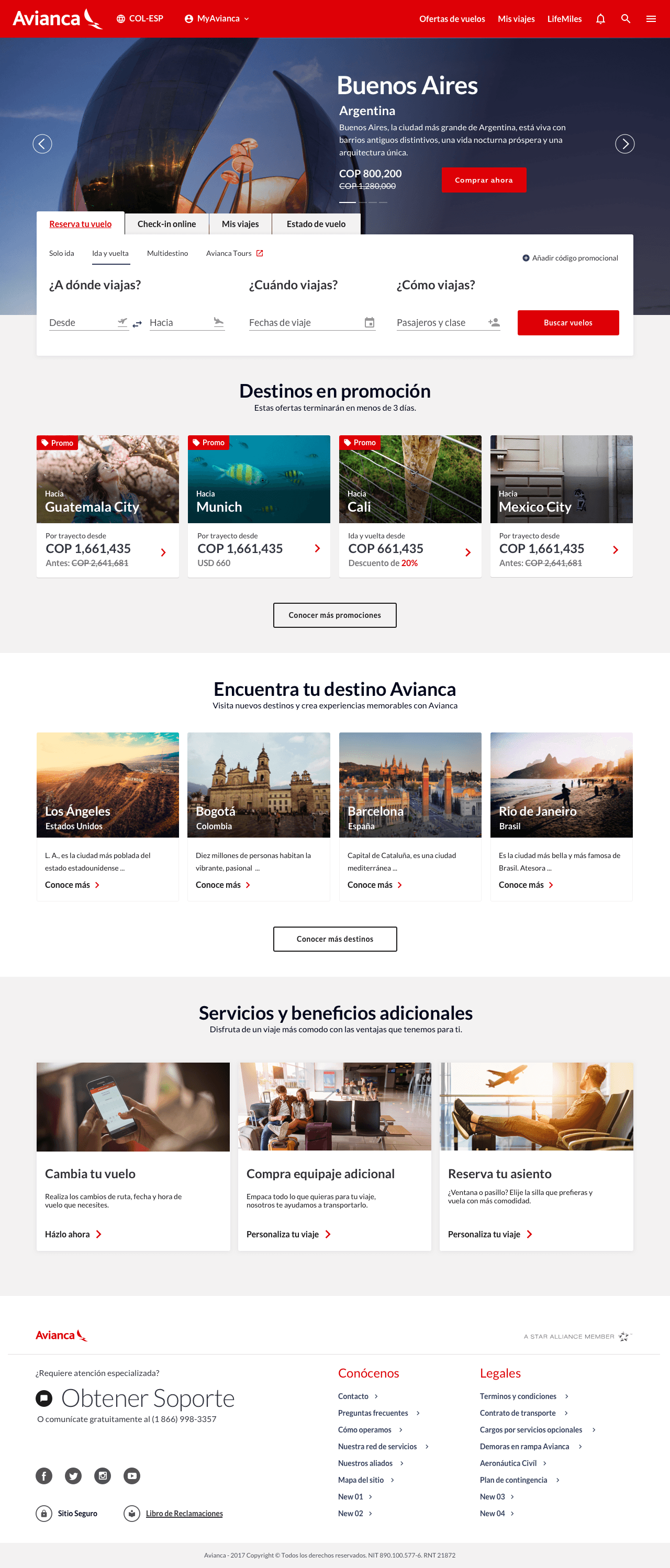
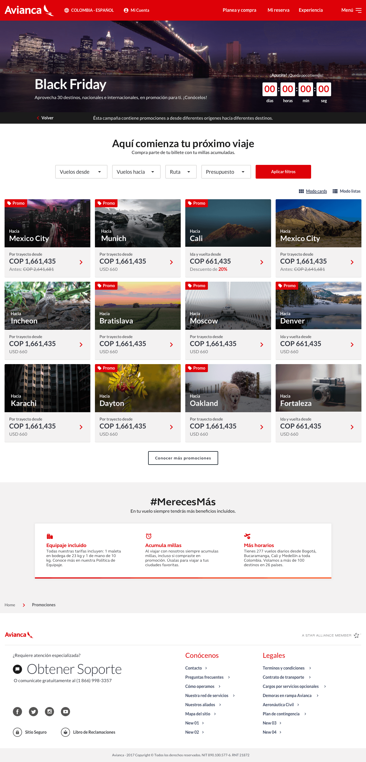
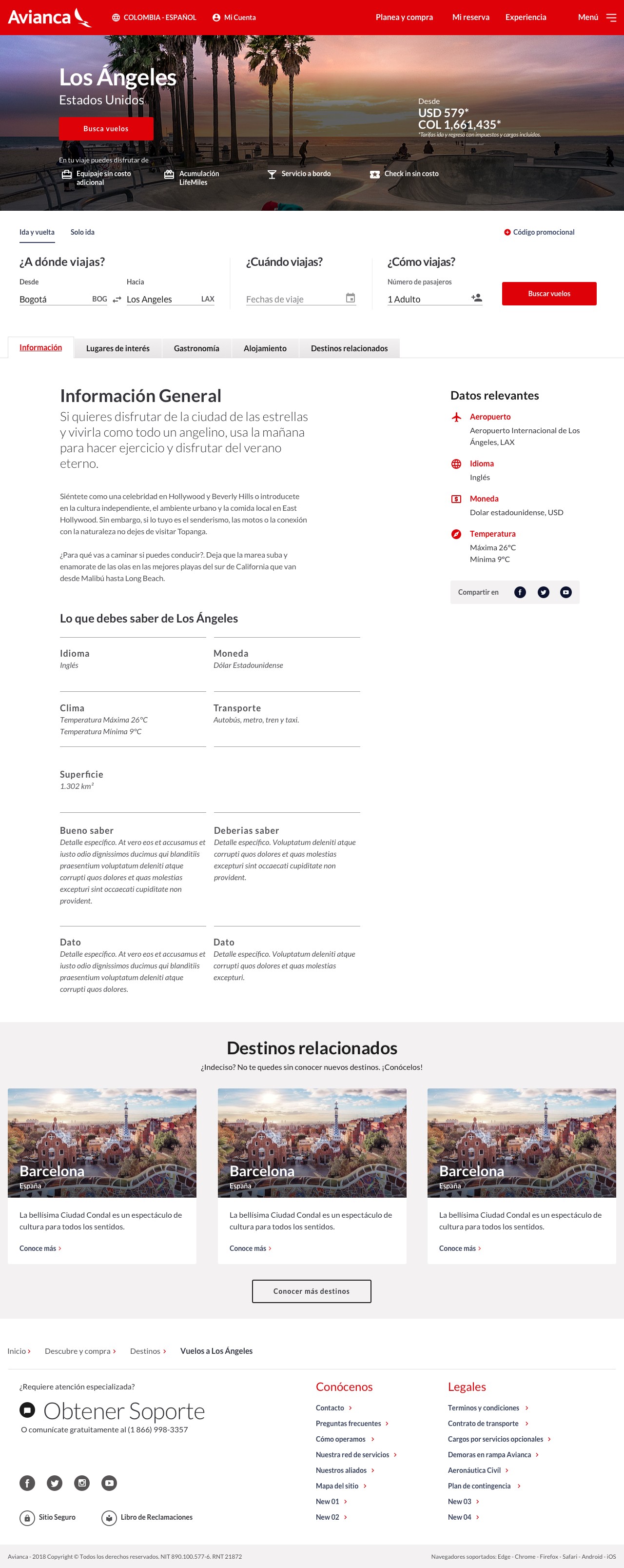
pages mockups locked for consistency
The Work
I designed wireframes/mockups and interaction specs for both locked pages and modular components across desktop, tablet, and mobile.
Modular System
Each module had documented responsive behaviors and administration parameters. Hero modules with configurable layouts. Content blocks for promotions and destinations. CTA components with style variations. Media grids adaptable per market. Every module followed AEM's constraints — specific grid, limited styling options, predefined component behaviors. Designing within those rules, not around them.
We built parameters into each module: image placement, text alignment, CTA styles. Content teams got enough control to localize without enough rope to break consistency.
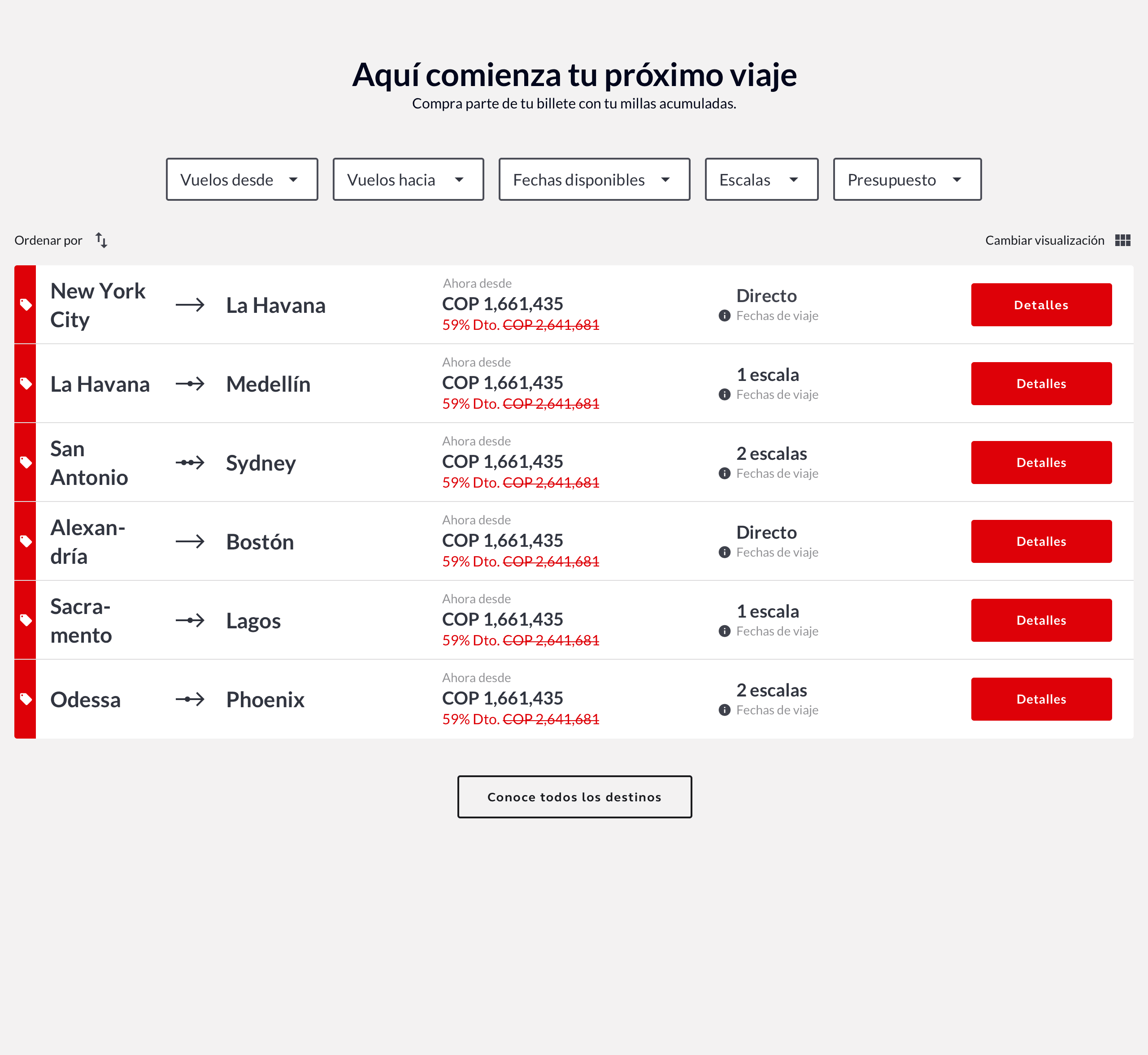
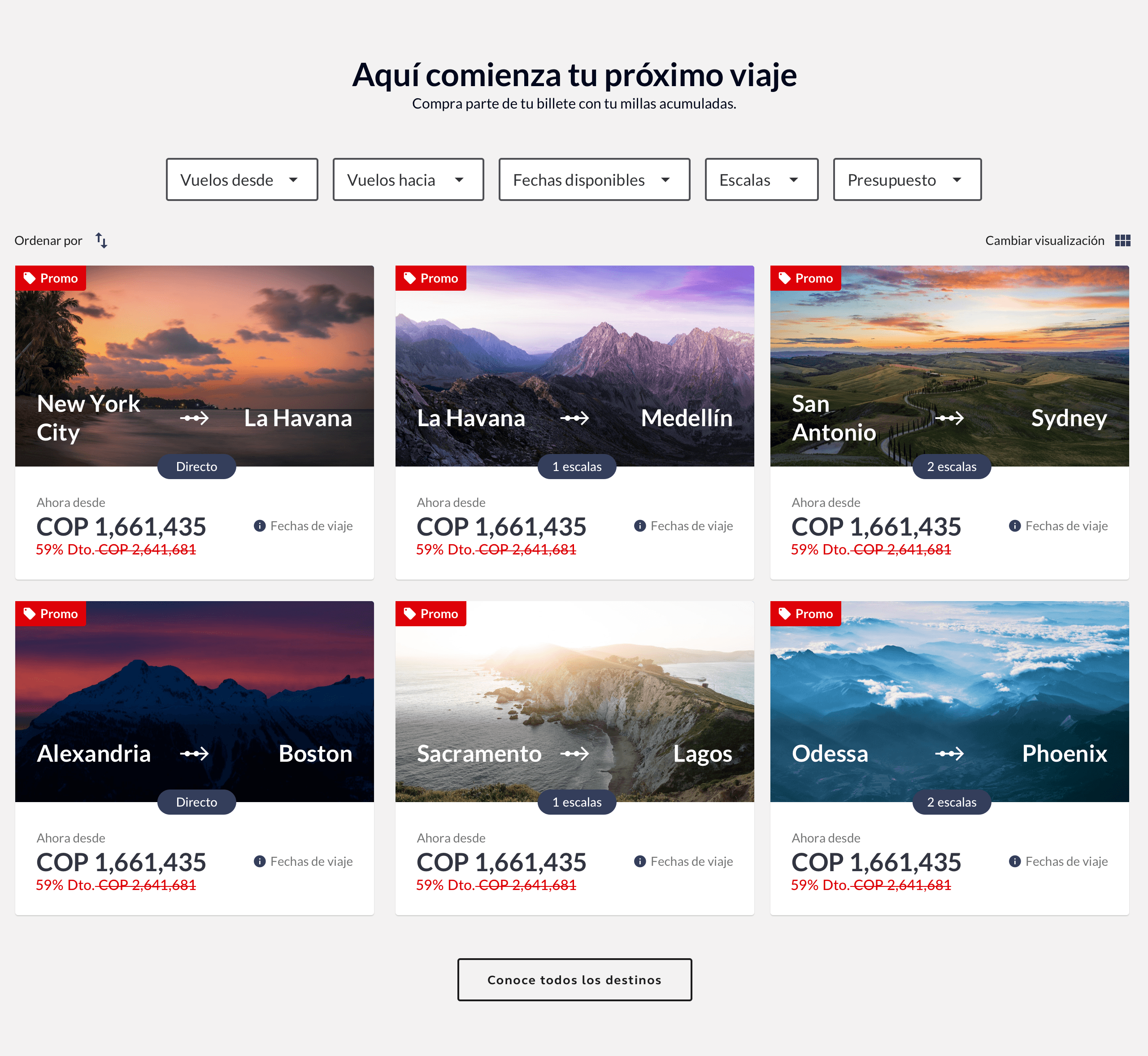
module parameters / admin configuration

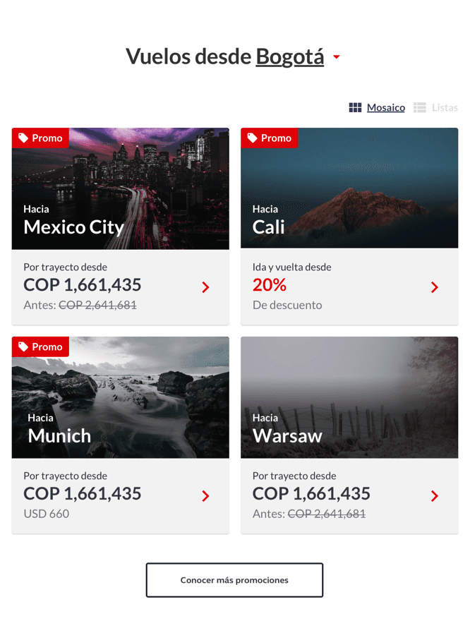


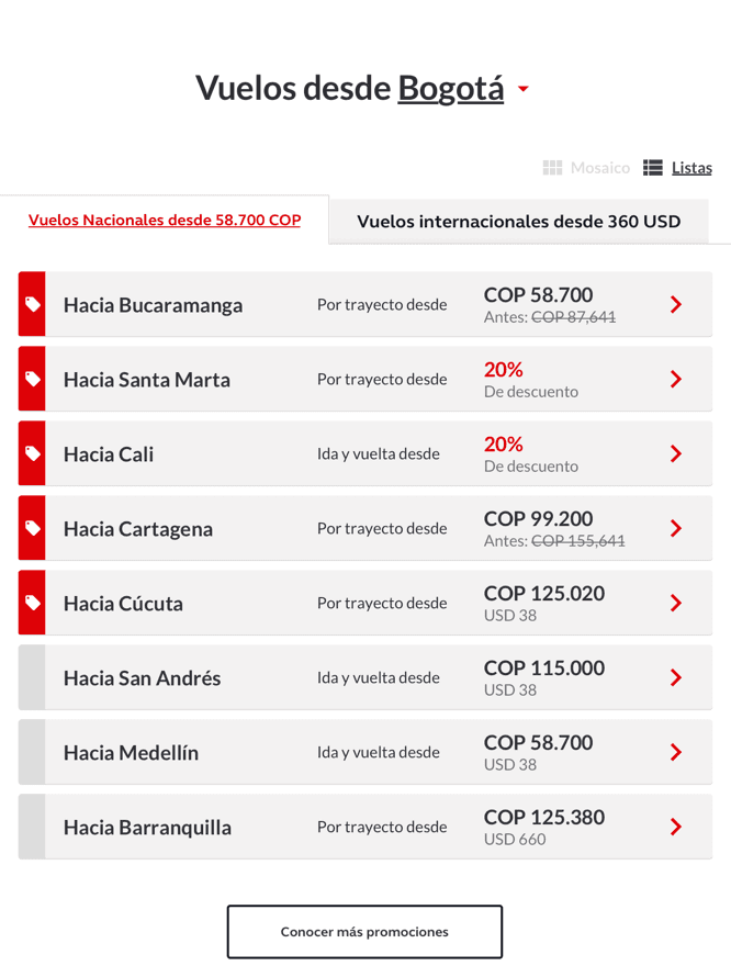


responsive behavior / admin parameters
Information Architecture
The old site had 9+ navigation levels and scattered content across redundant pages. We reduced it to 4 levels and merged duplicate screens based on the new IA. Some pages needed complete interaction rethinking — simplified booking flows, clearer navigation, better mobile patterns. Others just needed the new component library applied.
That combination — modular components plus simplified IA — is what made the system work at scale. Not a redesign. Infrastructure.
Handoff at Scale

We used Zeplin to centralize specs, feedback, and component documentation. Started with Jira tickets but that was too fragmented for this scale. Zeplin let us track component-level changes across six development teams in different time zones.
Final delivery: 230 screens across three breakpoints — down from an original scope of 450. Production-ready specs with interaction documentation for each module.
Some modules I couldn't fully document before the timeline ran out. That came back after launch — responsive behaviors that weren't specified caused content team headaches. "Why does this look wrong on iPad?" became a recurring question.


Zeplin workflow / component specs handoff
What Shipped
The timeline exploded. Accenture brought in CMS specialists. We cut scope: animations gone, module variations reduced, documentation abbreviated.
But the system worked. Content teams across 19 markets used the modules immediately — and asked for more. That's validation. Most enterprise CMS projects die from complexity.
Business impact was shared across teams. 23% conversion rate increase on the web platform. 60-70% growth in mobile sales — the site didn't have a mobile version before this project. That mobile number came from a post-launch review where conversion, marketing, and design teams all contributed. Multiple teams made that result happen. I'm claiming the design contribution, not the whole thing.
//web conversion
23%
Increase conversion rate
//scale
19
Markets with self-serve content
//Output
230
Responsive screens
What Changed
One lesson from this project changed how I work: understand the technical platform before opening your design tool. Not "read the docs" — sit with development, see what the CMS can and can't do, design from constraints up.
Before Avianca, I designed for users. After: I design for users, constraints, and platforms. Every project since has started there.